Divercial Web Portal Redesign
PROJECT OVERVIEW
Divercial is an employee experience feedback tool that helps organizations build inclusive workplace cultures. Their new Culture CoPilot aims to use genAI to automate and streamline the process of data interpretation and then provide action steps to create tangible solutions.
I had the opportunity to manage my team during this 3 week design sprint to conduct user research, C&C analysis, figure out the current problem our users are facing and design a seamless solution for our client, Divercial.
Our goal: Create a strong understanding of how users will engage and move through their web portal, step by step.
Team
Jennifer LaMar
Jair Oballe
Emily Frye
Joe Colengelo
Roles
Project Manager
UX Design
DESIGN PROCESS
My team and I decided to use the Double Diamond design process to help us understand and communicate our design, knowing that its going to be iterative at all phases. The 4 phases are Discover, Define, Develop and Deliver.
Tools
Figma
Asana
Zoom
Time Span
3 week sprint
Discover
USERS WANT SCANNABILITY, EMPLOYEE WELLBEING AND SUPPORT WHEN IT COMES TO DATA COLLECTION AND WORKPLACE CULTURE
To understand how users utilize tools like Divercial for feedback, we conducted one-on-one interviews with 9 users, including Divercial users and our personal network. We asked about workplace culture, opinion relevance, feedback collection, and effectiveness. Managers were also interviewed about their data collection platform experiences. We then analyzed and categorized the data into common themes, revealing three significant points:
COMPETITIVE ADVANTAGE IS PROVIDING AI GENERATED RECOMMENDATIONS
Along with user interviews, we used a list of competitors to conduct competitive and comparative analysis, focusing on the functions and features of two subsets of Divercial’s competition.
The first subset included competitors in terms of services of assessing workplace culture. All competitors we analyzed had great UX/UI, polling features on their site, and data visualization.
However, their features are not as robust as our second subset of competitors, who focus solely on their third party app capabilities, like Polly.
We drew inspiration from both subsets, ideas like a live preview of the survey you’re creating, or customization. But a way that keeps Divercial with the competitive advantage is that no competitors have a way of providing recommendations based on the data submitted by poll-takers.
HOW DATA IS VISUALLY DISPLAYED IS IMPORTANT TO USERS
As our final step of the discover phase, we conducted a heuristic evaluation, which is where we assess the usability of a product, whether it's a site or app. Divercial has a beta site and beta CoPilot product, so we took our evaluation with a grain of salt.
Define
STEPPING INTO THE SHOES OF A TEAM LEAD
It was important to my team and I to bring one of Divercial’s users to life and keep someone in mind when designing, so based on our user research I would like to introduce you to Peter!
SO, WHAT PROBLEM IS PETER FACING?
Peter needs a better way to scan data and assess productivity and wellbeing, so that he can create actionable steps to support team members, track work progress, and improve company culture at a glance.
HOW CAN WE SOLVE FOR THIS?
After determining the problem, we landed on a few How Might We Statements, which help to reframe our insights as opportunities for creating a solution for Peter.
How might we display the data collected from employees so that they can understand the information and take actionable next steps?
How might we simplify the feedback process for employees so that they are willing to engage with data collection?
MVP REVEAL
Based on our user interviews and some secondary research, we wanted to prioritize which features to include in the MVP. To make sure we were staying on track with our time constraints, we broke up different elements we wanted to include into Must Have, Should Have and Could Have features.
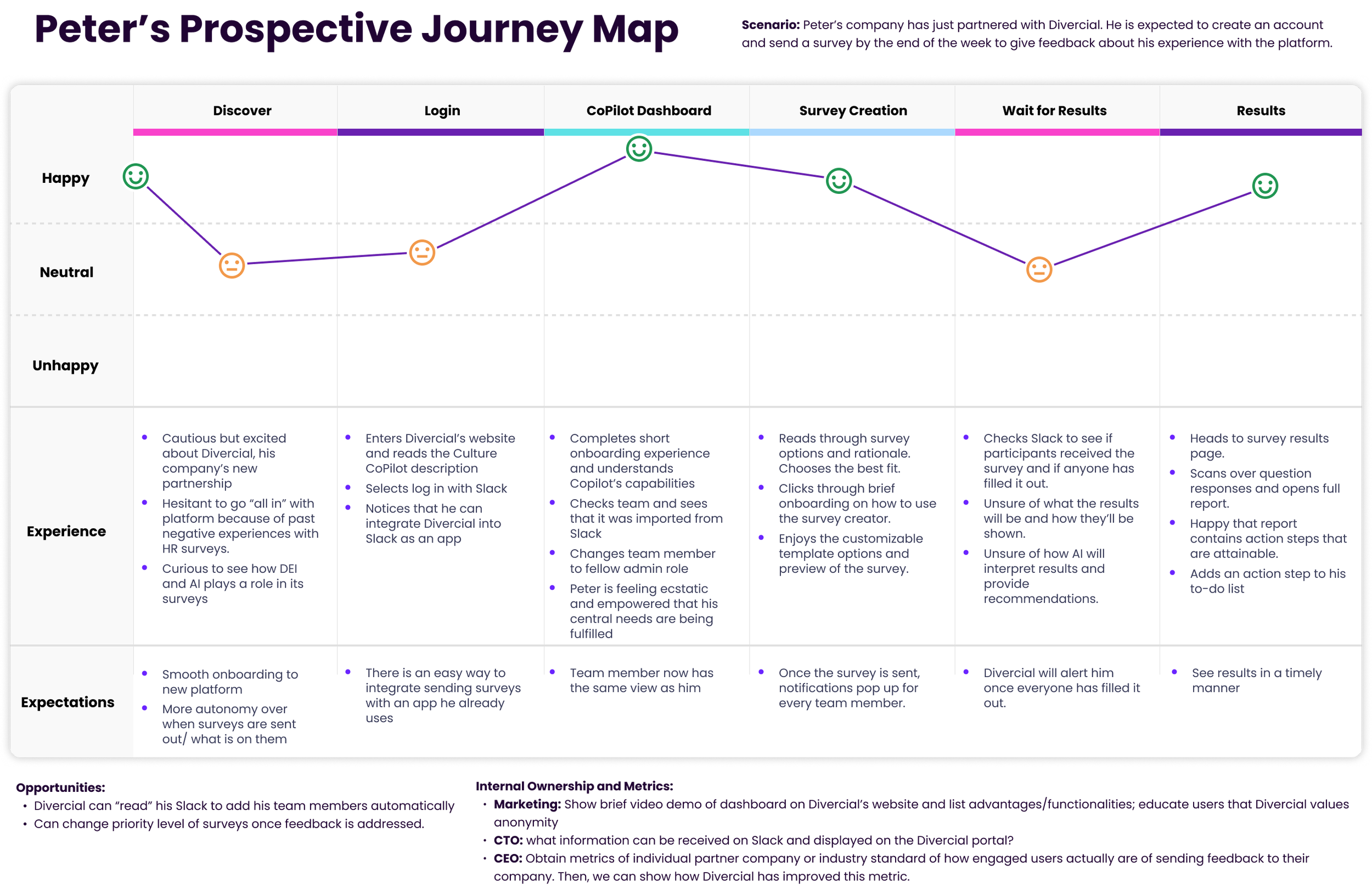
PROSPECTIVE USER JOURNEY MAP
It was important to us to showcase the steps that a user like Peter takes to accomplish a goal, while also showing their intended emotions along the way.
Develop
USERS FLOW
After determining the whole prospective journey for Peter, we wanted to break it down a bit more into 2 specific flows, based on the tasks we envision him taking while using the web portal.
LO-FIDELITY WIREFRAMES
To develop user flows further, we held a design studio session to brainstorm design ideas. After iteration, we finalized the initial design. The first screen includes a carousel feature for browsing survey templates.
Later in the flow, we created a dropdown menu with sections that expand to show users all the details of the current survey template they are editing.
To proceed, this screen shows how users access survey results and recommendations. Priority levels are added to each survey card: red, yellow, or green labels highlight necessary actions based on responses. Red requires immediate action, while green indicates everything is fine.
We made changes to how survey data is shown in the response section. We added different ways to visualize data and included easy-to-scan recommendations based off the full AI report.
LO-FIDELITY PROTOTYPE
Click here to see the first version of our prototype.
LETS PUT THE USERS TO THE TEST
To get feedback on our initial wireframes, we conducted 7 usability tests and asked users to complete two tasks related to our flows. The first was that users should be able to create and send a survey within one minute. The second was that users should be able to review the results of a specific survey and find the key takeaways within one minute as well.
QUANTITATIVE METRICS
The results from our first round of usability testing was really encouraging. Every user successfully completed both tasks, even though the completion time varied between participants. The average satisfaction score across both tasks was an 85, which we were happy to see, but also showed that we still have room for improvement.
QUALITATIVE INSIGHTS FROM TESTING
UPDATES MADE BASED ON USER FEEDBACK
Now that we understand the feedback, we made updates to the hi-fidelity prototype. One major change was how we redesigned the page for customizing survey templates. Instead of a collapsible dropdown, we used the space more effectively. This makes it easier for users to navigate different sections of the survey template.
We also added a description of the survey's purpose on this page to ensure users always know what template they are working on.
As we mentioned earlier, many users expressed confusion about the priority indicators. Some thought they were related to the survey's completion status, while others simply ignored them. This served as a reminder for us to clearly explain their purpose while improving the design.
To address this, we added an information box that appears when you click on the info icon in the top header.
We enlarged the recommendations box on our survey response page to include actionable next steps, aiming to catch users' attention and help them implement suggested recommendations.
Another change was to create a full survey report page that can be accessed without having to leave the Divercial portal. We updated some of the data visualization options as well as provided a CTA button for a PDF download in case users were interested in saving the report locally to their device.
Develop
HI-FIDELITY PROTOTYPE
Click here to see the first version of our prototype.
VALIDATING OUR DESIGN DECISIONS IN A SECOND ROUND OF TESTING
With the time we had, we wanted to get our hi-fi prototype in front of a few more users' eyes. We gave 3 new users the same 2 tasks as we did in round 1, but added in one more task:
Sign up from the landing page and go through an onboarding process
QUANTITATIVE METRICS
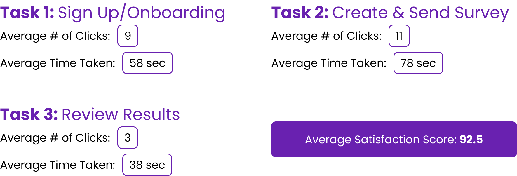
We wanted to be able to compare the new data to see how we improved, so we again measured success rate, number of clicks, time taken to complete the tasks and SUS score. Along with completing the tasks faster, our SUS score also improved by 8.8%, placing us in the excellent category!
QUALITATIVE INSIGHTS FROM TESTING
Although most was positive, we did gain some insightful feedback from these users.
NEXT STEPS
With the time constraint on this project, we couldn't design every function for Divercial’s portal. When presenting our findings to our stakeholders, we informed them of what our next steps would be/what we encourage them to consider going forward.
WHAT I LEARNED
I really enjoyed managing my team throughout this design sprint. I used my time management and leadership skills, as well as my knowledge of the design process, to create a product that my team and I are proud of. I also learned about integrating with Slack, which was a valuable learning experience for me.
It was really helpful to put myself in the user's shoes and assume they don't know how to use the site. By implementing an onboarding process and using familiar features, we can make their experience more enjoyable and encourage them to keep using Divercial.


